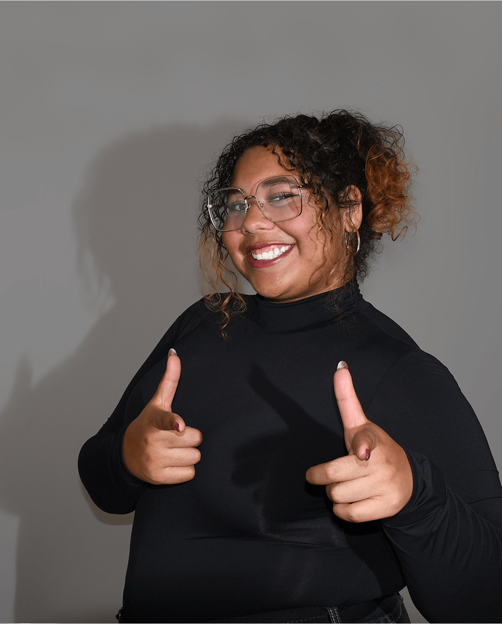
I'm Ryen,
a Graphic Designer
& Illustrator
from Niagara Falls
Ontario.
About
I’m a graphic designer with a passion for illustration, transforming ideas into vibrant visuals that captivate and inspire. My work isn’t just about making things look good. I’m driven to create illustrations that make a difference and leave an impact. I believe in the power of visuals to tell stories, spark emotions, and inspire change. While illustration is my main focus, I also dive into digital design, editorial layouts, and branding, crafting cohesive visuals that resonate. Whether it’s an expressive illustration or a thoughtfully designed brand, I’m all about making designs that connect.
Download my Resume- Why Design
Well why not? When there's something you can't do, you find someone that can right? I just happen to be the person who does the creative work.
- What Does She Use?
I use mostly Adobe products, but I love finding and learning new software. So I'm pretty much on everything.
But don't get me wrong, I'm an apple user so if it doesn't work on my mac I ain't using it.
Expertise
- Digital Design
- Illustration
- Web Design
- Editorial Layout
- Branding Identity
Experience
Freelance
Self Employed
September 2022 - Present
I spend my time working along side my clients to create works that not only I love but they love too. I take both in-person and online requets for services and have experience with both.
Education
Niagara College
Master in Graphic Design
April 2025
In my three year program at Niagara College I spent my time learning a little about everything. I recieved an Advanced Diploma with impressive marks in all of my classes and came out with the knowledge I needed to start in the field.
Recent Works
Here are some of my favorite projects I have done lately. Feel free to check them out.
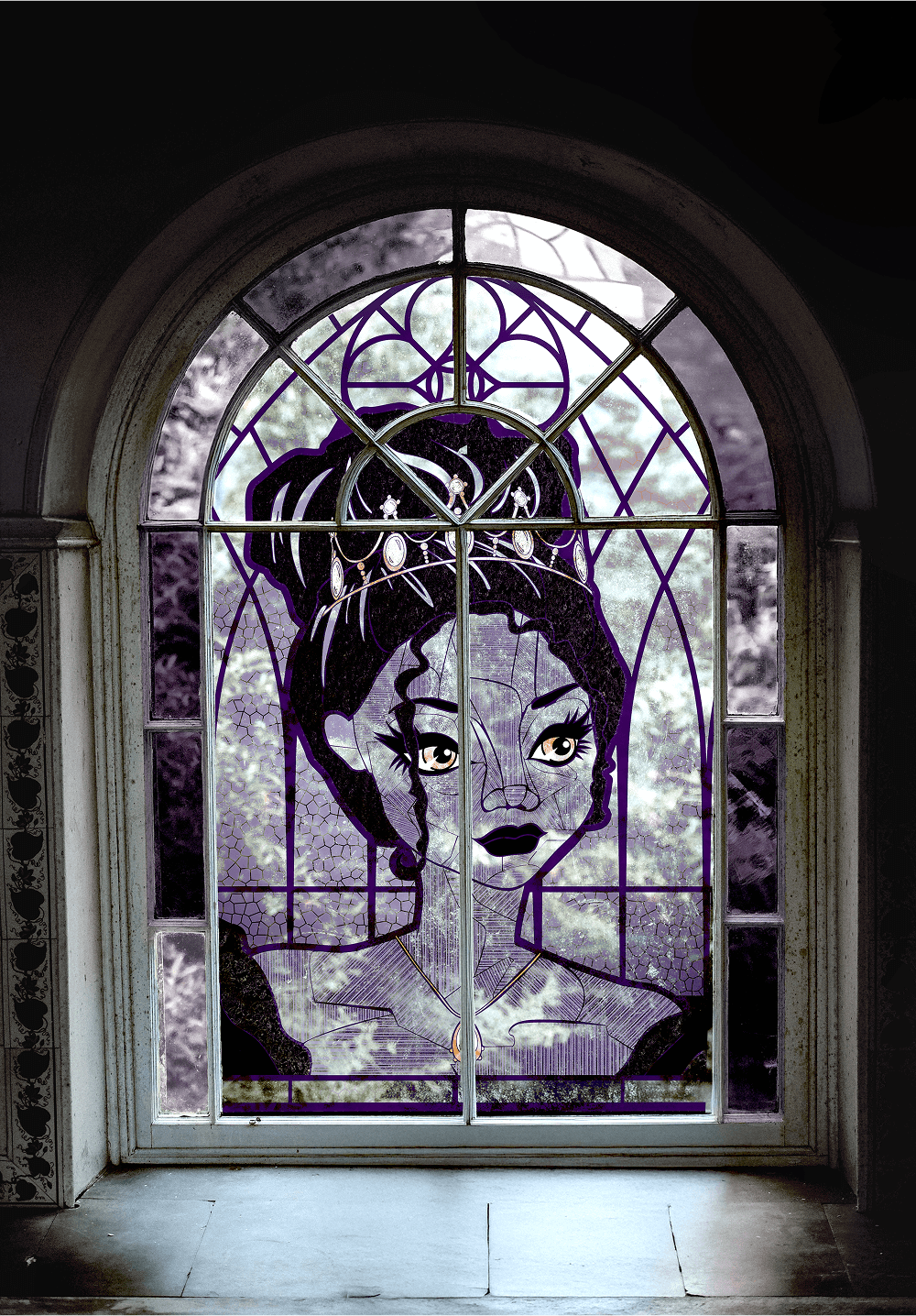
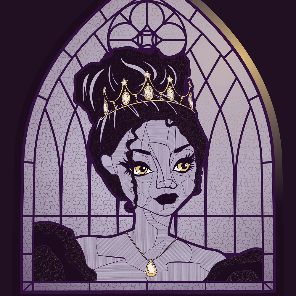
MH Portrait
This is a stylized self-portrait at a 10”x10” scale. I wanted to see how many different kinds of textures could layout over a vector shape, without compromising the integrity of the look and the overall file.
- Illustrator
- Photoshop
- Fresco
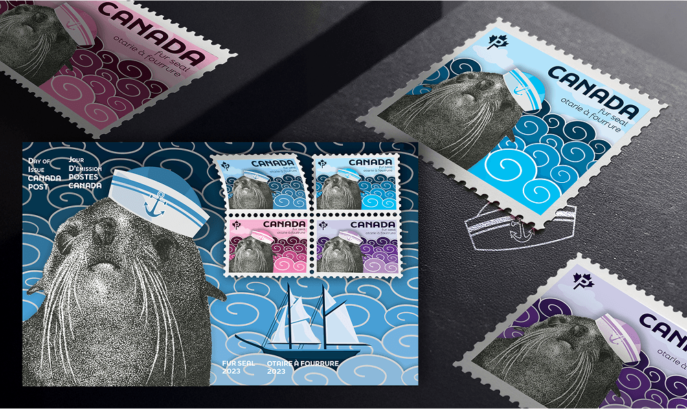
Postage Stamps
This collection of stamps was client based as it’s goal was to show off one of Canada’s native animals, the Fur Seal, and national symbol the Bluenose, for Canada Post. This stamps were designed both by hand and digitally highlighting the textures of stippling ink and flat vector shapes.
- Ink
- Illustrator
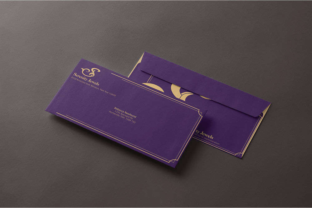
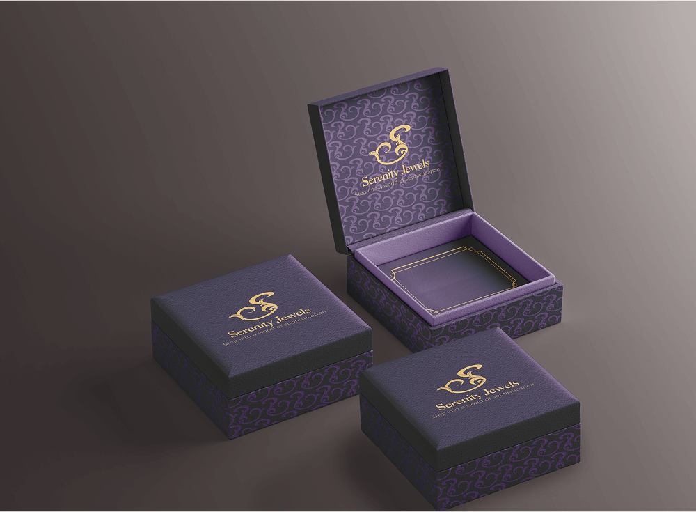
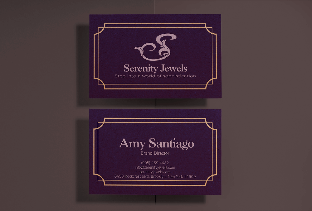
Serenity Jewels
Serenity Jewels is a fictitious jewelry company that caters to the high-end buyer by keeping a dark and sophisticated style. Design assets include: logo design, business card, envelope, letterhead, buttons, brand guideline book, and jewelry box mockups.
- Illustrator
- Indesign
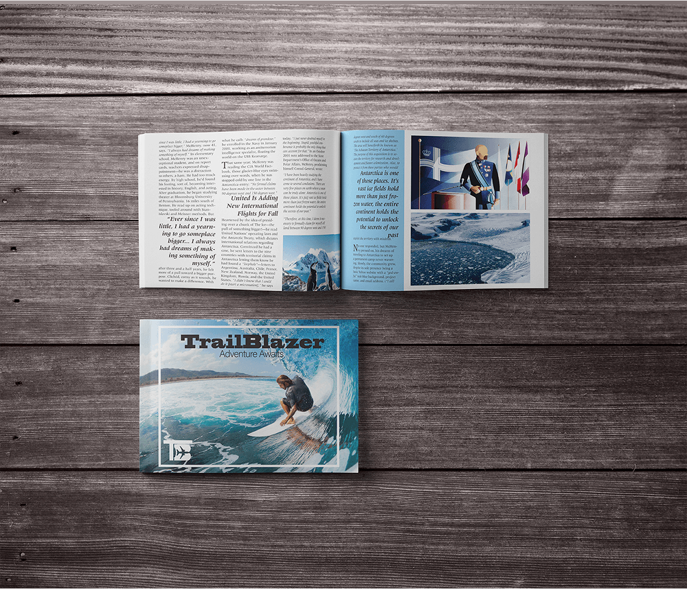
Since Day One
TrailBlazer is a magazine line that's goal is to highlight the lesser known authentic travel destinations within a respective city or country. In this edition it dives into stories and colour schemes of Antarctica and Australia. Through the use of pull quotes I made sure to emphasize some of the most important and interesting information readers would want to see.
- Indesign
- Illustrator
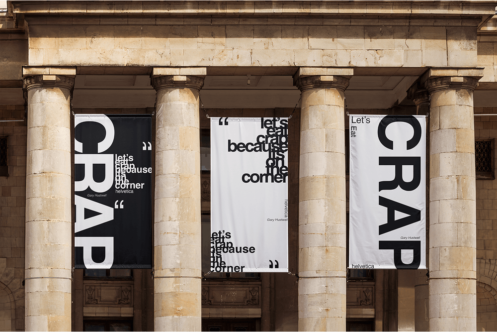
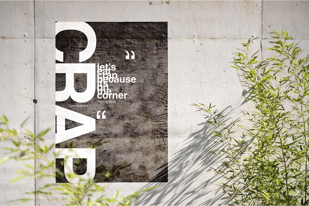
Helvetica
This 2'x4' posters goal was to show off one of my favourite quotes from Gary Hustwell (the creator of the Helvetica typeface) and to see how far I could push the legibility and arrangement of type before it became unreadable. But hey who wouldn't want a giant poster that says crap in big bold letters on it.
- Illustrator
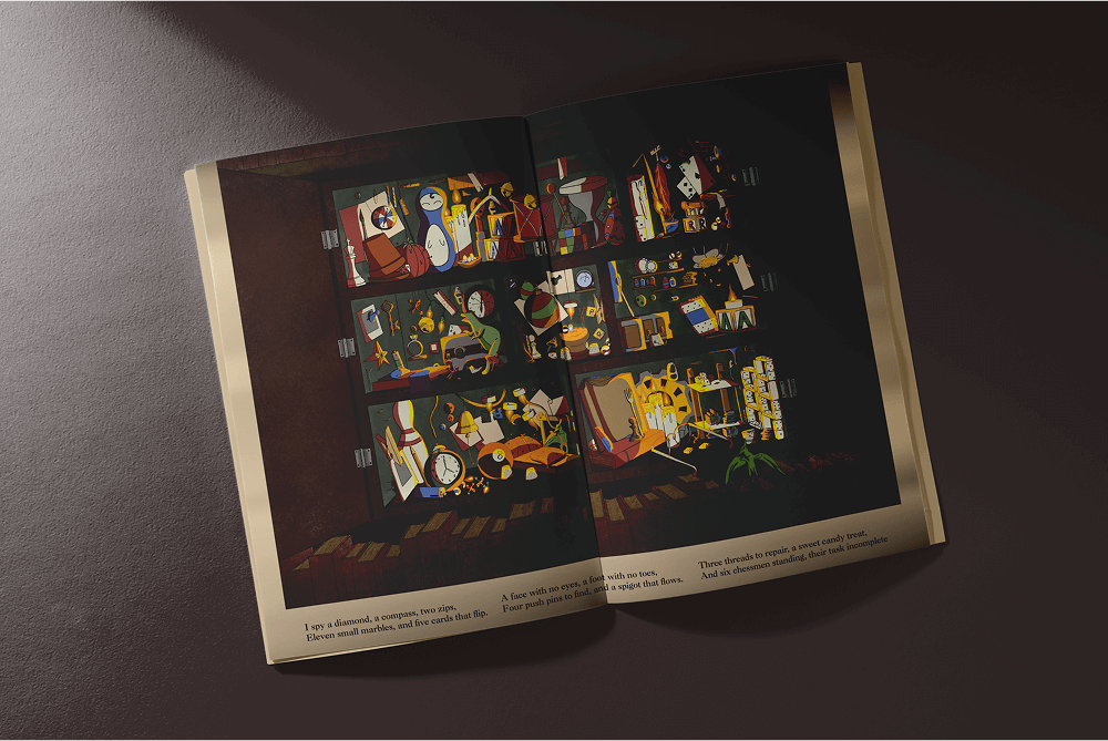
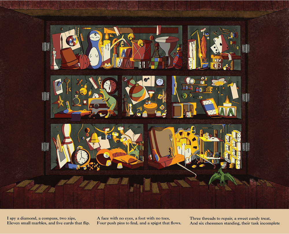
I-spy
This is my take on the classic I-spy book franchise of a look and find children’s book. The goal of this project was to have as many small items wrapped up together within 7 rooms. My aim was to make something but fun and engaging, while also including an equally entertaining riddle to go along with the hidden items.
- Fresco
- Illustrator
- Photoshop
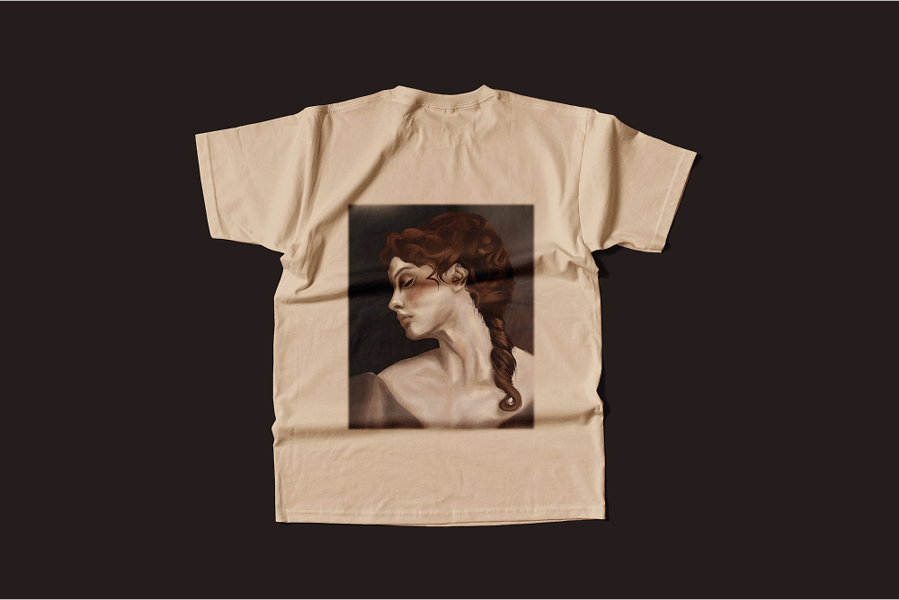
Look Away
This Illustration’s goal was to show off both the smoothness and textures that can be produced through the use of digital art. With a vintage theme, I pushed to see how far I could take the use of a very limited colour palette and create something beautiful that any person would proudly display on their worn shirt.
- Fresco
- Illustrator
- Photoshop
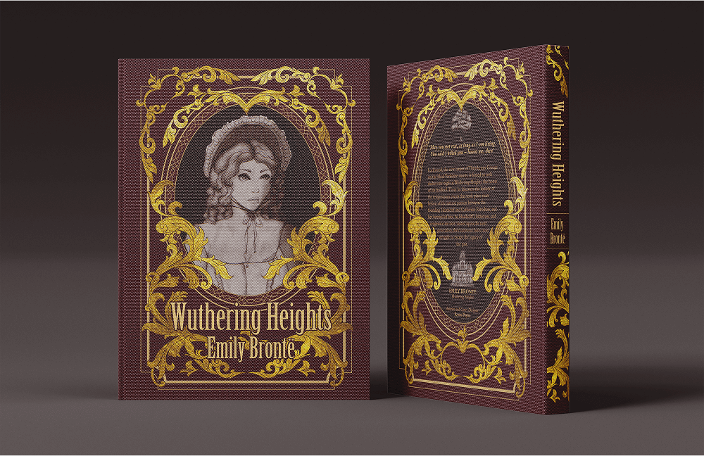
Wuthering Heights
The goal of this project was to redesign a currently existing public domain book cover and interior layout. This was my first time really going in depth in InDesign so there was definitely a learning curve to figuring out what I was trying to do. With the cover file I ended up making the size of it way to big with all of the clipping masks for the gold detailing in illustrator that I needed to find a way to dramatically decrease the file size. I ended up moving the gold filigree over into Photoshop and flattening everything to minimize the size, which ended up working out well. I have personally read the book which made it a lot easier to understand how I wanted to design the cover. The book is set in the year 1801 so I wanted to pull aspects from the period. The use of the filigree was common in high standing houses at the time, and with it needed to come along a font choice that emanated that high standing. I had to pull in some research as to what the characters would be wearing and some of the main symbols of the book. I originally had a completely different idea for the cover that was going to showcase 5 different elements of the book: the mansion, a horse, a tree,a ghost, and the main character Catharine. Theses other elements were going to sit in the four corners surrounding Catharine, but with a little reworking I still kept the use of the mansion and tree in the final design, and I think the finished product turned out much better than my original idea. These are the first drafts of my hand done drawings that I was originally going to use as those elements, as a little sneak peak into my process.
- Illustrator
- Photoshop
- InDesign
- Ink
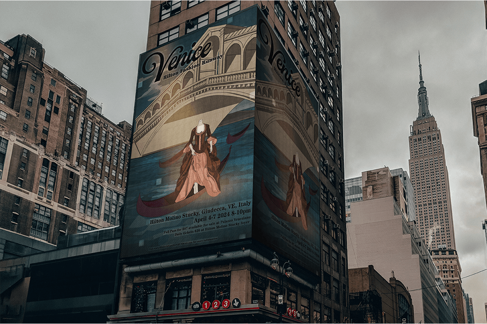
Hilton Fashion Runway
In this client poster I was tasked with creating a visually interesting piece that melded the city of Venice and a historical fashion show. I brought in elements that represented the city through the gondolas on the water and Ponte di Rialto bridge. I asked myself what would show off a runway the best without strictly depicting the average walkway. So I came up with the idea of using a mannequin to show off the fashion that the event would be showcasing.
- Illustrator
- Photoshop
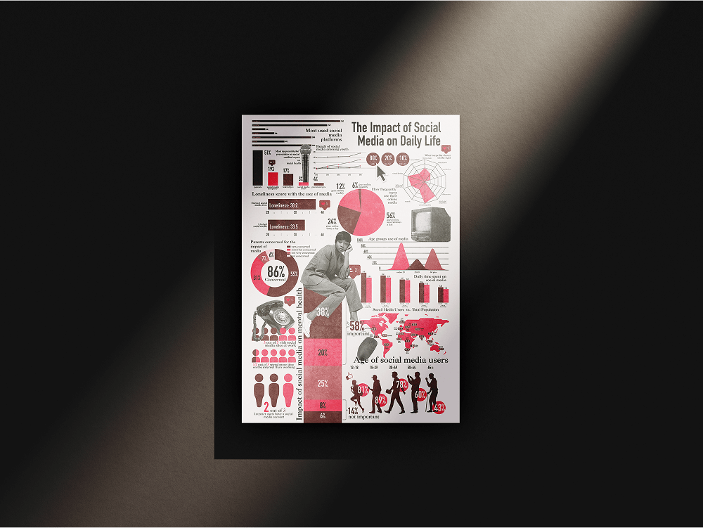
Social Media's Impact
The goal of this print size (8.5”x11”) infographic was to inform on some of the biggest statistics surrounding the use of social media. I wanted to manage to fit as much information in the space without sacrificing legibility, giving the eye somewhere to look and read everywhere on the page.
- InDesign
- Illustrator
- Photoshop
Get In Touch
I would love to hear from you. Whether you have a question or just want to chat about design, tech or art — shoot me a message.